Creating a library with Angular

You’re probably used to creating Angular applications, but what about Angular libraries?

First, it’s essential to define what an Angular library is. A library is a collection of components/pipes/directives or services bundled together that can be shared and used in multiple code repositories. As a result, Angular libraries are designed to be published on npm (publicly or privately) so they can be shared with other people externally or internally.

If you want to start a new library from scratch, these Angular CLI commands will get it done:

The above commands create a projects/my-lib folder in the workspace, with a sample component and service in it. The main difference between a library and an application is that a library exposes public features that can be imported into other libraries or applications.

Such features are listed and exported in public-api.ts in the library folder. That’s where you decide what’s public/private in your library code. In this example, the library is just one service:

Then, to test or build your library, you can use regular Angular CLI commands such as:

Once built, a library can be published to the public npm repository with one single command. This command has to be run from the dist folder where the compiled library can be found after running your production build:

Note that this command requires an npm account and npm authentication before you can publish. Upon publishing, the version number used in your package.json will be used as the public version number on npm:

And on npm’s website:

At that point, anyone can run npm install [your-library-name] and use your code in their projects. Nice and easy!

Note that the library I used in that example is a work in progress and should not be used as-is in your apps.

Angular 17 is coming soon…

Angular 17 tentative release date is set for November 8, 2023. Be ready for a few good surprises along the way, but for now, I can share that the new control flow features will be available with that version.

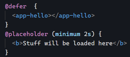
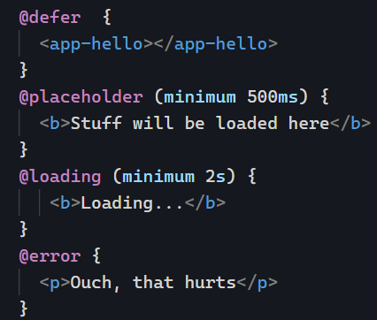
There was a control flow RFC a few months back. The Angular team received valuable feedback from it and decided to go with the following syntax:

The above syntax can be used instead of ngIf and its awkward else syntax. Also visible in the above example is @defer, a way to lazy-load a component based on different criteria.

Of course, we’ll cover all this in the newsletter in November once all these features are officially released. In the meantime, mark your calendar: November 8 is the date.

Fine-tuning your eslint configuration

Last week, we introduced eslint and how it can help improve our code by identifying places where we have dead code or don’t follow best practices. Sometimes, we “break” some of these rules on purpose or decide to adopt a different convention, which is perfectly fine.

In that case, instead of giving up on eslint entirely, a better idea is to change its configuration to tweak the severity of a rule or even disable it. An es lint rule has three different severity settings:

  • “off” or 0 – turns the rule off
  • “warn” or 1 – turns the rule on as a warning (doesn’t make the lint command fail)
  • “error” or 2 – turns the rule into an error (makes the lint command fail with exit code 1 – a good option to fail a continuous integration build)

Such severity tweaks can be made in the .eslintrc.json file created in your project by the Angular schematics:

In the above example, I made the first two rules throw an error instead of a warning (I’m very much against disabling type-checking in TypeScript), but I’m OK with seeing some var keywords instead of let, so I turned off that third rule.

Getting the rule’s name is easy: When the linter fails, that name will be displayed in the console. Here @typescript-eslint/no-empty-function :

Some rules accept more configuration options to create an allowlist of accepted values. For instance, @angular-eslint/no-input-rename prevents you from renaming @Input values, but you can specify a config option that allows a few input names:

The config for that rule becomes an object that looks like this:

The above config allows renaming inputs only if the new name is check or test. This gives you more flexibility than turning off a rule entirely if it’s too restrictive for you.

Improve your code with eslint

eslint is a popular linter that parses your code and outputs a list of warnings and errors to help you improve. The library is designed to lint JavaScript code, and there are extra plugins for TypeScript and Angular so we can get even more specific feedback for our components and services. Here is an example of linting output:

A linter is a perfect complement to a compiler. For instance, angular-eslint, the eslint plugin for Angular, will also look at your HTML templates and flag code that doesn’t follow the Angular style guide. It’s also looking for possible mistakes, such as getting the ngModel 2-way data-binding syntax wrong:

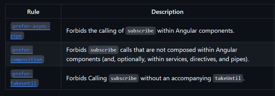
To give you a better idea, here is the list of all the template rules and all the Angular TypeScript rules. If you want to give eslint a try, the first step is to install it with the help of some schematics:

This will download the proper dependencies and plugins and set up everything necessary to lint your code. If you’re using an older version of Angular or building a library instead of an app, there are step-by-step instructions to follow here. Once the set-up is done, all you have to do is run:

This command will parse all your files and output feedback in the console. Note that several IDEs can detect your eslint config and suggest automatic fixes to linting errors, which is even better!

Directive Composition API

In the past few weeks, we’ve covered different examples of directives, such as the CDK Listbox directive and the CDK Drag and Drop directive. I have mentioned that directives are underused in Angular applications these days, and one way to use more directives is to adopt the directive composition API.

Let’s consider our previous example of a list of items:

Let’s assume we want to make our list flexible enough to support re-ordering items using drag and drop. To do so, we could start using multiple different directives on the same element, such as cdkOption and cdkDrag (code example here on Stackblitz):

While the above code works, it’s designed for a one-time use case. If we know that our application will use several droplists that support drag-and-drop, we should start thinking about creating our own custom directive that refactors these different features in one place. Enter the directive composition API:

This new directive draggableOption is composed of both cdkOption and cdkDrag to achieve the desired result. We have one input text that is forwarded to the cdkOption input thanks to this syntax:

Note that both inputs and outputs can be forwarded that way (code examples here). The beauty of this approach is that our new directive has very little code while packing reusable features in a concise syntax. This is how we would use our new directive:

You can find that example live on Stackblitz here. There are a few caveats with the directive composition API, mainly that it only works with standalone directives and that the options to “forward” inputs and outputs are limited for now. However, the composition API is an excellent option to make our code more reusable and immune to copying and pasting collections of directives from one component to another.

How to handle drag-and-drop with Angular?

Drag and drop features can dramatically improve the UX of a web application. Implementing drag and drop with Javascript seems intimidating, which is why we have the Angular CDK (Component Development Kit).

Let’s say we have a list of items we want to be able to reorder using drag and drop:

Thanks to the CDK drag-and-drop directives, such a task is easy. Here’s all the code needed to enable it:

The two directives cdkDropList and cdkDrag enable the drag-and-drop feature. We also need the following code in our component class:

The moveItemInArray function is a utility function from the CDK, so we don’t have to worry about that.

See the source code and try this example in action on Stackblitz here.

Increasing binding specificity

Let’s say we want to trigger an action when the user hits enter on their keyboard. We could do something like this, capturing the keydown event and then decide what to do based on the entered key:

While the above works, it’s pretty verbose. Instead, we can make our binding more specific by doing the following:

Now, that’s a lot more specific and less verbose. The same goes for class bindings. Here’s a lengthy example:

Since all we want to do is toggle the green class on or off based on a boolean expression, the following syntax is shorter and better:

You can see these examples in action on Stackblitz.

State Management: Selector

We know how to create a State and dispatch actions to update its value. Now let’s see how to receive updates when the State gets updated.

Most state management libraries provide what is known as Selectors. A Selector query function runs against our State and returns an Observable. For instance, with NgXs, a Selector can be created with the @Select decorator as follows:

The above code creates an Observable that returns any value update in state.currencyInfo. If you don’t like decorators, you can also use the select function from the Store service:

Both options return a similar Observable. If a Selector of a slice of your State is used repeatedly, you can make it a memoized selector by using the @Selector decorator in your State class. This example creates a new selector that returns just the currency property of our State:

Such a Selector can be used with @Select decorator in your components/services as follows:

You can see that code in action on Stackblitz.

Using the CDK ListBox for custom list selection

The Angular CDK is an important toolkit for building Angular applications. We’ve already covered how to display an overlay using the CDK. Today, let’s create a custom list selection feature using CDK ListBox.

Often, HTML dropdowns are too basic to allow for meaningful customization of what gets rendered in the dropdown. This has led to the creation of several custom components, such as Material Select.

But what if you’re not using a library and still need to customize a list of items for your users? Something like this, for instance:

Implementing such a UI with HTML is not very difficult. The complexity of the task comes from getting all the expected behaviors for an accessible experience, such as keyboard interaction and focus management.

This is where the cdkListbox directive shines. Here’s an example:

The few lines of code in this example add the following select-dropdown-like features to these basic HTML list items:

  • A numerical value is associated with the user selection (1, 0, or -1) thanks to cdkOption
  • Typeahead is available. If I click on the list and then type “o” on my keyboard, the “Okay” option gets selected.
  • The current selection can be changed using the keyboard’s up and down keys.

And there are many more possibilities to explore. For instance, enabling multiple selections in the list is as easy as adding a cdkListboxMultiple attribute on our list element:

And now I can do this:

You can see that example in action on Stackblitz here. Another nice feature of the Angular CDK is that all its directives are standalone, so we can import just what we need in our components:

5 useful pipes from ngx-pipes

ngx-pipes is a library with over 80 different pipes to choose from. Here is a list of 5 of my favorites:

timeAgo: An excellent alternative to Moment for duration formatting, which means turning a date/time into: “a few seconds ago” or “last week,” for instance.

ucFirst: Uses an uppercase letter for the first word in a sentence, unlike Angular’s uppercase pipe, which returns the entire string in uppercase.

filterBy: Filters an array of objects based on your criteria.

orderBy: The name says it all—orders items in an array based on a given property.

percentage: An excellent complement to the percent pipe. You can use the percentage pipe to compute the percentage value and then the percent pipe to format that value in any way you want.

You can find the complete list of pipes from ngx-pipes here. Note that those pipes are not standalone yet, but there’s a pull request to make that happen.