What’s new in Angular 16.2? Lifecycle methods

Angular keeps evolving at a steady pace, and Angular 16.2 brought a couple of interesting features to the table.

The first feature is an addition to the Signals API that was part of a specific RFC for Signal-based components. The new feature consists of two functions:

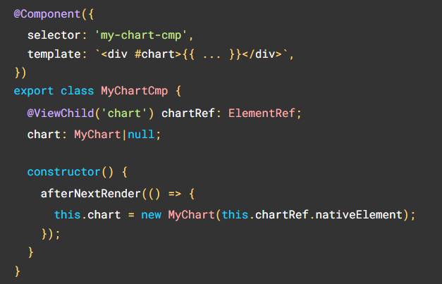
afterNextRender

A function that allows registering a callback to be invoked the next time the application finishes rendering. It is similar to the ngAfterViewInit lifecycle method but for signal-based components.

The main use-case for this new lifecycle is to initialize a third-party, non-Angular-friendly library to hook itself on the DOM after Angular generates it:

afterRender

A function very similar to the afterNextRender, with the difference that instead of running the registered callback just once, it will run it after every single render, similar to ngAfterContentChecked. This could be used to read something from the DOM when it changes, such as the height of an element:

Angular Material Theme Generator

As we started covering Angular Material with a few different posts, today, I want to address one of the common objections to Angular Material: Sometimes, people don’t like the look and feel of the library and fear that it won’t match their business requirements.

While it is true that the default themes picked by the Material team aren’t for everyone, with a lot of bright pink, purple or flashy green, I have seen several companies customize Material to make it their own with great success.

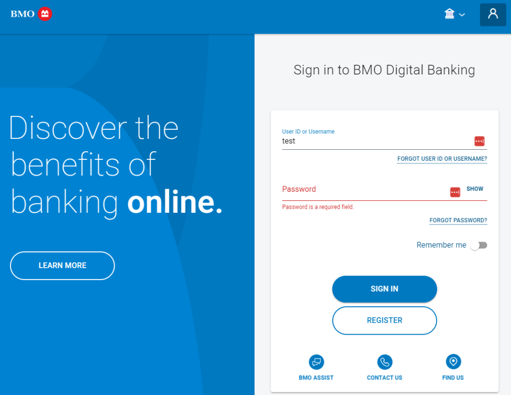
Here are a few examples:

Bank of Montreal (BMO)

Air France

You can see that in some cases, it’s actually hard to recognize Material components in those apps. On the Air France website, the tabs and slide toggle are the most recognizable components.

How to generate my own custom theme?

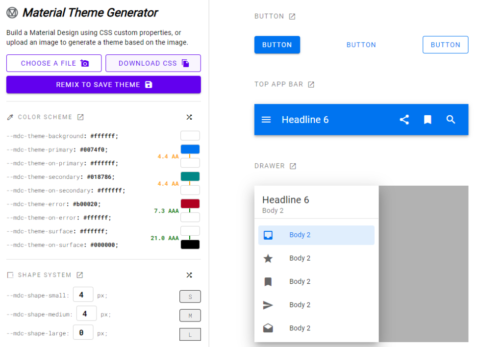
One of the easiest way to see what’s possible is to use the (unofficial – though it comes from a team at Google) Material Theme Generator:

With the theme generator, you can:

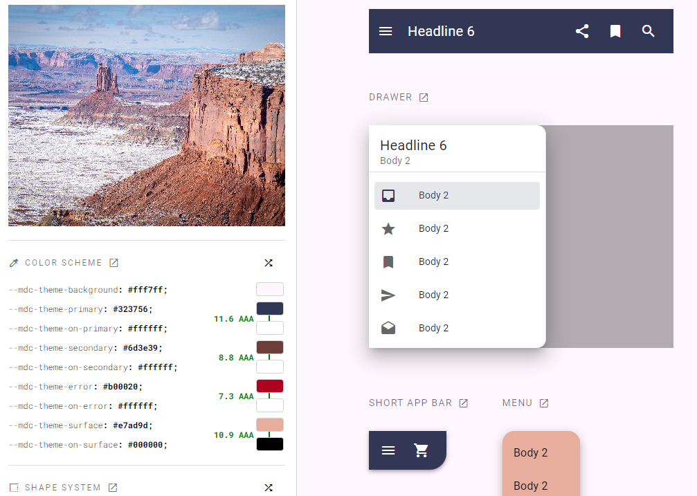
  • Generate a theme from an image (such as a company logo!) and the tool will pick the colors and do the rest
  • Tweak all possible variables using color pickers and see the result on every component on the right-hand side.
  • Then export your customization as a CSS file using th “Download CSS” button.

Here I tried uploading a picture of mine from the Canyonlands of Utah last winter, and the resulting auto-generated theme is impressive – I didn’t touch any of the settings:

Migrating Angular Material to v15+

This is a guest post by Duncan Faulkner. You can read his first post on Angular Material here. This is the third and final post in this series.

Note: This post will cover upgrading to Angular Material version 15 from Angular Material 14—all changes affected version 15. Once the migration to Angular Material 15 is complete, migration to Angular Material 16 is straightforward.

The team at Angular Material has created a schema that will do all the heavy lifting when migrating to the new MDC format.

To upgrade your application to version 15

ng update @angular/material@15Code language: CSS (css)

This will automatically run the migration schema and move your project over to use the legacy version, ensuring that your application continues to run with minimal changes.

Once your project has upgraded, you can now run the migration tool. This will migrate from the legacy to the new MDC format.

ng generate @angular/material:mdc-migration

This will update your project, including TypeScript, styles, and templates, as much as possible. Where it cannot update your code, the migration tool will insert comments into your code for a developer to fix.

// TODO(mdc-migration):...Code language: JSON / JSON with Comments (json)

It’s also possible to migrate parts of your application; this can be a single component or a range of components, and the migration script will prompt the directory and components to migrate.

The migration to MDC is a welcoming and positive step. It improves accessibility, adheres to the Material Design Specification, and allows better adoption of future specification versions.

Legacy components

Currently, the Angular Material library includes all the legacy components. If you’re not able to upgrade to the latest version and want to continue to use these legacy components, you need to import the legacy module, for example:

import {
  MatLegacySliderModule,
} from '@angular/material/legacy-slider';

@Component({
  selector: 'slider-formatting-example',
  templateUrl: 'slider-formatting-example.html',
  styleUrls: ['slider-formatting-example.css'],
  standalone: true,
  imports: [MatLegacySliderModule],
})
export class SliderFormattingExample { 
    ...
}Code language: JavaScript (javascript)

Please note: The legacy versions are currently marked as deprecated and will be removed in version 17 of Angular Material.

Accessing route information with Angular

The Angular router comes with many interesting features, such as lazy-loading, guards, resolvers, or nested routes.

One of these features is the ability to access route parameters and route information within the component displayed by the router. This can be done by injecting the ActivatedRoute service in our component.

This ActivatedRoute contains a lot of information:

The most commonly used attributes are:

  • paramMap: An Observable of route parameters such as id in the route /product/:id/info
  • queryParamMap: An Observable of query parameters such as q in the route /product/search?q=test
  • data: An Observable of the data resolved by route resolvers such as hero in this example of a resolver.

snapshot gives us the current value of those same parameters instead of using Observables.

Another option appeared with Angular 16. We can bind router information to component inputs instead of using ActivatedRoute.

This works for the three categories of parameters covered earlier: Route params, query params, and resolved route data.

This means that this old and verbose approach:

can be replaced with the following concise and router-independent code:

The only config needed for this to work is the one line of code described in this article.

Analyzing your bundle size

We covered build budgets and how they can help keep your application performant by detecting when a new dependency dramatically increases the size of your build output.

If you want to look at your build bundle and determine which dependency/module is the biggest, there’s another tool at your disposal: The Webpack Bundle Analyzer.

To install it, use the following npm command:

npm install --save-dev webpack-bundle-analyzer

Then, run your Angular build with the option that generates build statistics:

ng build --stats-json

Finally, run the Webpack Bundle Analyzer to read those build stats and give you a visual output of that bundle:

npx webpack-bundle-analyzer dist/stats.json

This command opens a new tab in your browser with the following user interface. Each rectangle represents a Javascript module. The bigger the rectangle, the bigger the module.

In the above example, we can see that the application code (main.js – in green color) is a lot smaller than the application dependencies.

For instance, we could improve this project by removing polyfills.js, as these polyfills were included to maintain compatibility with the now-retired Internet Explorer, and they take more space than our application code!

Using the Angular Material Slider

This is the second guest post by Duncan Faulkner. You can read his first post on Angular Material here. This is the second post in this series.

The mat-slider was recently rewritten in Angular 15 as part of a refactoring towards MDC (Material Design Components for the Web). The most notable change to the mat-slider is the element now requires up to two input elements, instead of just a mat-slider element, this allows us to use the slider as either a single slider (with one input) or a range (with two inputs).

The original mat-slider looked like this in versions prior to Angular Material 15:

<!-- original -->
<mat-slider></mat-slider>Code language: HTML, XML (xml)

And in versions after 15:

<!-- single slider -->
<mat-slider>
  <input matSliderThumb />
</mat-slider>

<!-- range slider -->
<mat-slider>
  <input matSliderStartThumb />
  <input matSliderEndThumb />
</mat-slider>Code language: HTML, XML (xml)

Slider usage options

It’s also possible to set the range slider to have a min/max or both, for example:

<!-- range slider -->
<mat-slider [min]="30" [max]="75">
  <input matSliderStartThumb />
  <input matSliderEndThumb />
</mat-slider>Code language: HTML, XML (xml)

If min is not supplied then zero is assumed, likewise if max is not supplied then one hundred is assumed. If step is supplied then maxis required otherwise the slider will not be able to calculate the step division.

The thumbLabel directive has now been replaced with a new discrete attribute, this controls whether the value indicator tool-tip is shown when the slider is dragged.

<!-- original -->
<mat-slider thumbLabel></mat-slider>

<!-- replaced with -->
<mat-slider discrete>
  <input matSliderThumb />
</mat-slider>Code language: HTML, XML (xml)

To show the tick-marks on the slider add the showTickMarks attribute.

<mat-slider showTickMarks>
  <input matSliderThumb />
</mat-slider>Code language: HTML, XML (xml)

For now the tickInterval property has been removed from the API, though this is being reviewed and could be reintroduced in the future. If we want to define the interval of the tick marks we use the step property and the tick marks will match the step:

<mat-slider discrete showTickMarks step="10">
  <input matSliderThumb />
</mat-slider>Code language: HTML, XML (xml)

The displayValue property has also been removed in favour of the new displayWith this property controls the text value of the indicator, we need to provide a function for this property where we can manipulate the value to be displayed. We use the min property to set the lowest value, the max property to the highest value we want the slider to be an set the step property to what we want the increment to be.

<mat-slider min="0" max="100000" step="1000" [displayWith]="updateLabelWithFn">
    <input matSliderThumb />
</mat-slider>Code language: HTML, XML (xml)
export class MySliderComponent {
  updateLabelWithFn(value: number): string {
    return value >= 1000 ? Math.round(value / 1000) + 'k' : `${value}`;
  }
}Code language: JavaScript (javascript)

The updateLabelWithFn function takes the value from the slider and [in this instance] if the value is greater than or equal to 1000 then it will round the number and divide it by 1000 and concatenate the letter k to the end, this helps to keep the text small and in the thumbLabel.

The valueText property has also been removed, we now have two options we can use the input’s aria-label-valueText or use the displayWith property.

<!--before Angular 15 -->
<mat-slider [valueText]="someTextValue"></mat-slider>

<!--after Angular 15 -->
<mat-slider>
  <input [attr.aria-valueText]="someTextValue" matSliderThumb />
</mat-slider>

<!--after Angular 15 -->
<mat-slider [displayWith]="displaySomeTextWithFn">
  <input matSliderThumb />
</mat-slider>Code language: HTML, XML (xml)

With the rewrite the API of the slider has also changed and has introduced two new components the MatSliderThumb and MatSliderRangeThumb and provide the following properties:

  • @Input() value: number
  • @Output() valueChange: EventEmitter
  • @Output() dragEnd: EventEmitter
  • @Output() dragStart: EventEmitter
  • @Input() percentage: number

And the following methods:

  • blur
  • focus

There are two notable absences from the mat-slider and these are:

  • invert – this reversed the start and end of the slider
  • vertical – this rotated the slider 90°, you could also invert a vertical slider

These have been removed as they are not part of the Material Design Specification for the Web (MDC).

Changing the color of a slider

Like all Angular Material components we can change the color of a mat-slider using the color property.

<mat-slider [color]="primary">
    <input matThumbSlider>
</mat-slider>Code language: HTML, XML (xml)

In our next post, we’ll see how to migrate from Angular Material 14 to 15+.

Asynchronous form validation with Angular

We’ve already covered how to write custom form data validators with Angular. We also covered how to display custom validation feedback to the user. Today, let’s take a look at how to perform asynchronous validation of our form data, which is useful when we need to make an HTTP request to a server to validate user input.

The approach for asynchronous validation is very similar to what we do with regular validation. The only difference is that instead of returning ValidationErrors, we return an Observable or a Promise of such ValidationErrors:

A ValidationErrors object is any keys and values you want to return. I like using keys that are the name of the form input throwing the error and the value being the error message I want to display on the screen. For instance, this is one of my typical ValidationErrors objects:

If you want to dig deeper, here is a link to a tutorial showcasing an example of an async validator. It’s also worth noting that asynchronous validators introduce a new validation state besides VALID and INVALID, which is PENDING. You can use that validation state to display a spinner or temporarily disable a form input while the asynchronous validation occurs.

ngOnDestroy lifecycle hook

After covering ngOnChanges and ngOnInit earlier, let’s talk about ngOnDestroy. The ngOnDestroy lifecycle hook is called when an Angular component/directive/pipe is destroyed. I’ll refer to components only in this post, but everything you read also applies to directives and pipes.

This can happen when the component is removed from the DOM, or the application is destroyed.

Most of the time, a component gets destroyed when it’s removed from the DOM as a result of:

  • A ngIf directive condition becomes false, thus hiding the element from the screen.
  • The router navigates to a different screen, thus removing the component from the DOM.

The ngOnDestroy hook is a good place to do cleanup tasks, such as unsubscribing from Observables (though there are better options to automatically unsubscribe your Observables), closing sockets, or canceling setInterval and setTimeout tasks (though you could use RxJs timer for that):

Getting Started with Angular Material

This is a guest post by Duncan Faulkner. He is an Angular developer for a fintech company based in the UK. A software engineer with over twenty years of experience, Duncan has been working with Angular since the early betas, written blog posts for ng-conf and several short books on Angular Material. He’s also the maintainer for the @ngbracket/ngx-layout (formerly @angular/flex-layout) open-source project.

You can follow him on Twitter, LinkedIn, Medium and YouTube by using this bio link.

Angular Material is a component library for Angular projects, this library comprises of a number of User Interface components (UI) and a Component Development Kit (CDK). In this series of posts we’ll use Angular Material version 16, there haven’t any major changes to this version of the library.

Some of the components in this library are:

  • buttons
  • inputs
  • cards
  • date picker
  • progress bar
  • grids
  • toolbar
  • and many more:

Adding Angular Material to an existing Angular application is quite straight forward, navigate to your Angular project in a terminal window and type:

ng add @angular/material
Code language: CSS (css)

This will install Angular Material, the CDK and the Angular Animations, during this installation process we are asked to make a few choices.

  • The first one will show the version of Angular Material that will be installed and whether to proceed or not.
  • Next, choose either one of the pre-built themes or create a custom theme.
    • The available pre-built themes are:
      • deeppurple-amber, Palette (Primary, Accent, Warn) – deep-purple, amber, red.
      • indigo-pink, Palette (Primary, Accent, Warn) – indigo, pink, red.
      • pink-bluegrey, Palette (Primary, Accent, Warn) – pink, blue-grey, red.
      • purple-green, Palette (Primary, Accent, Warn) – purple, green, red.
    • Custom – I will discuss this in a future post.
  • Next, include Angular Material typography styles in our project.
    • This will add the mat-typography CSS class to the body tag: <body class="mat-typography"> <app-root></app-root> </body>
  • Finally, include browser animations in our project.
    • Declining this will disable most of the animations of Angular Material.

Now the installation is complete, there have been a few changes made to our project.

  • The following two dependencies were added to the package.json file."dependencies" : { "@angular/cdk": "^16.2.1" "@angular/material" : "^16.2.1" }
  • The Roboto font was added to the index.html file: <link rel="preconnect" href="https://fonts.gstatic.com"> <link href="https://fonts.googleapis.com/css2?family=Roboto:wght@300;400;500&display=swap" rel="stylesheet">
  • The Material Design Icon font was also be added to the index.html file. <link href="https://fonts.googleapis.com/icon?family=Material+Icons" rel="stylesheet">

There are also some changes to global CSS styles:

  • Removed the margins from the body tag
  • Changed the height : 100% on html and body tag.
  • Made the Roboto font as the applications default.

Now we have Angular Material installed, let’s try out an Angular Material component in our application. In the app.component.ts file add the following.

import { Component } from '@angular/core';
import { MatSliderModule } from '@angular/material/slider';

@Component({
  selector: 'app-root',
  templateUrl: 'app.component.html',
  styleUrls: ['app.component.scss'],
  standalone: true,
  imports: [MatSliderModule],
})
export class AppComponent {}
Code language: JavaScript (javascript)

And in the app.component.html file add the following line.

<mat-slider>
  <input matSliderThumb />
</mat-slider>
Code language: HTML, XML (xml)

Here we’ll just add a simple mat-slider to the page to test everything is working.

If we now run the application in the browser, we should now see a mat-slider on the page.

Coming up in part two of this series we’ll dig deeper into the mat-slider and the recent changes from Angular Material 15 as Angular Material 16 was mainly minor changes and bug fixes.