Using a loading template with ngrxLet

A while back, I wrote about how ngrxLet is an improved version of the async pipe. I also covered how to use skeleton loaders with Angular.

Today, let’s look at how we can use these two tools to display a “loading” template while an observable is waiting for data.

As a reminder, here is how ngrxLet can be used to track different observable events:

In the above code snippet, we receive the values emitted by the number$ observable in a variable n. We would receive any error in a variable e. We would receive the completion status (true or false) in a variable c.

Here is how we can pass a custom loading template to ngrxLet using a template reference variable:

Of course, the loading template can be customized with anything you want, including a skeleton loader or an animated gif image. That feature is called a suspense template, and an observable is in a suspense state until it emits its first event (next, error, or complete as covered here).
Skeleton loaders with Angular

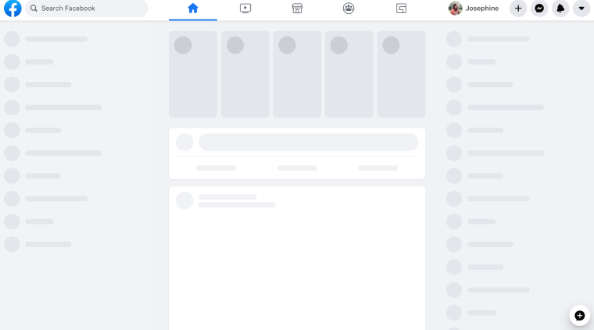
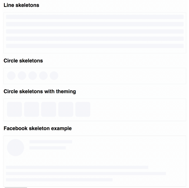
Skeleton loaders are grey-shaded shapes that indicate when a part of the screen is loading. Here is an example of skeleton loaders for Facebook:

ngx-skeleton-loader is a small component library that does just that. It gives us access to different skeleton loaders ready to be used in our applications:

What’s nice about that library is that we can customize different aspects of the skeletons, such as animations and colors. You can find some live examples here.

If you want to explore skeleton loaders for your application, feel free to look at my popular tutorial: How to use a skeleton loader with Angular?

The tutorial has several code examples that can be used as-is.

Anti-pattern series: Calling a method in a template

If you’re calling a method/function in the HTML template of any of your components, try the following experiment: Add a console.log("here") inside that method.

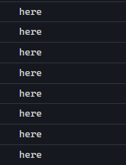
Then, interact with your application by clicking around, entering information in a form, etc. What you’ll see in your console is something like this:

Why is this happening? Angular’s change detection runs every time an event occurs in the browser. Zone.js tells Angular that “something happened” when we interact with an Angular application. Then, Angular checks its component tree for updates. If you’re using methods in your HTML templates, the only way for Angular to see if the output of that method has changed is to… call it again.

As a result, using methods in your HTML templates is not recommended. Doing so can impact performance negatively. Instead, use bindings to class properties as follows:

Before:

After:

Note that if you need to call a method/function to perform some formatting, you should create a custom pipe. Pipes are designed to run only when their input data changes, which means they are optimized for best performance by default.

You can take a look at an example here on Stackblitz. I added a console.log("here") inside my custom pipe to showcase that it runs only once:

Angular 16 Preview: Binding Router Information to Component Inputs

Passing parameters to routes is a frequent task with Angular. Before Angular 16, we had to inject the ActivatedRoute service and retrieve the parameters from that service using the snapshot or params properties.

With Angular 16, we can get those values automatically bound to the component inputs using the following router config:

If you’re using the RouterModule.forRoot() syntax, then enabling component input binding looks like this:

RouterModule.forRoot(routes, {bindToComponentInputs: true});Code language: JavaScript (javascript)

According to the documentation, this option can bind all route data with key-value pairs to component inputs: static or resolved route data, path parameters, matrix parameters, and query parameters.

For instance, assuming we have a URL parameter called id, if we enable the component input binding feature, then all we need in our component is an @Input decorator to receive that value:

What I like about this option is that our components do not need the ActivatedRoute service anymore, meaning they don’t have to be used just as routed components. Instead, they could be used in other scenarios where the id is passed as an HTML attribute, just like any other non-routed component. As a result, our components are more generic and not tied to a single use case.

Angular 16 Preview: Required Inputs

The @Input decorator plays an essential role in the Angular framework as such inputs for presentation components allow us to fine-tune application performance by using the onPush change detection strategy.

Earlier in this newsletter, we also talked about how inputs justified the existence of the ngOnInit lifecycle hook.

Inputs are about to become even better in Angular 16 with the addition of required inputs that would throw a compile-time error when an input for a component/directive is required but not set:

The syntax is easy to remember, too. Angular 16 is scheduled to be released this week, and I’ll be posting more new features of that new version all week long.

The main feature of v16 will be Angular Signals, so I just released a short video course to learn all you need to know about Angular Signals for just $9!

How to create your own two-way data binding with Angular?

If you’ve ever used [(ngModel)] with Angular, you know what two-way data binding is. The idea is to have a variable that works simultaneously as an Input and an Output.

In today’s post, we will see how to implement such a two-way data binding on our own so that we can use the [()] syntax on any of our component properties, such as message in the following code:

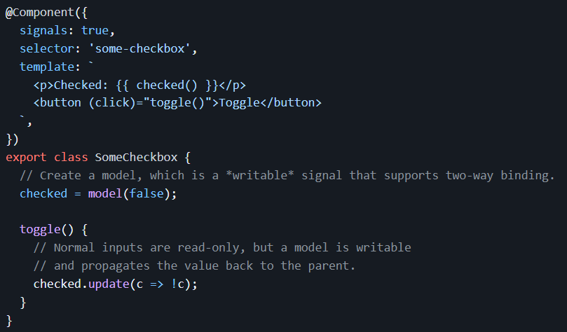
Before we get into this tutorial, I want to tease that signal-based components will have such two-way data bindings available out of the box with the following syntax – using a model() function instead of the @Input and @Output decorators we’re used to:

Note that the above feature will not be a part of the initial developer preview of Angular Signals coming out in less than two weeks with Angular 16. However, it might be available in developer preview in six months with Angular 17.

In any case, here is the link to my custom two-way data binding tutorial and a code example in action on Stackblitz.

ngOnInit vs. constructor in Angular

Today’s post is all about clarifying when to use a constructor and when to use ngOnInit to initialize data in our Angular components.

From a chronological standpoint, the constructor is called first. Then, once all component inputs are initialized, Angular is going to call ngOnInit.

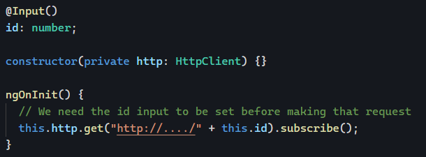
From that definition, it makes sense to use ngOnInit only when your initialization code needs a @Input value to be set. Something along those lines:

And that’s the only rule. Some might be surprised to read this, but you could initialize everything in your constructor if your component has no inputs. There is no performance impact in doing one or the other.

I would argue that triggering an HTTP request in the constructor is better as it’s going to happen sooner (we’re talking milliseconds, though) than if we do it in ngOnInit.

As a result, in the absence of any official recommendation in the Angular style guide, you can choose one or the other.

Lazy-loading standalone components

Now that we’ve covered both standalone components and lazy-loading Angular modules, we can introduce the concept of lazy-loading a standalone component, which wasn’t possible before Angular 14.

From a syntax standpoint, the only difference is that we use loadComponent instead of loadChildren. Everything else remains the same in terms of route configuration:

Now, one of the benefits of lazy-loading a module is that it can have its own routing config, thus lazy-loading multiple components for different routes at once.

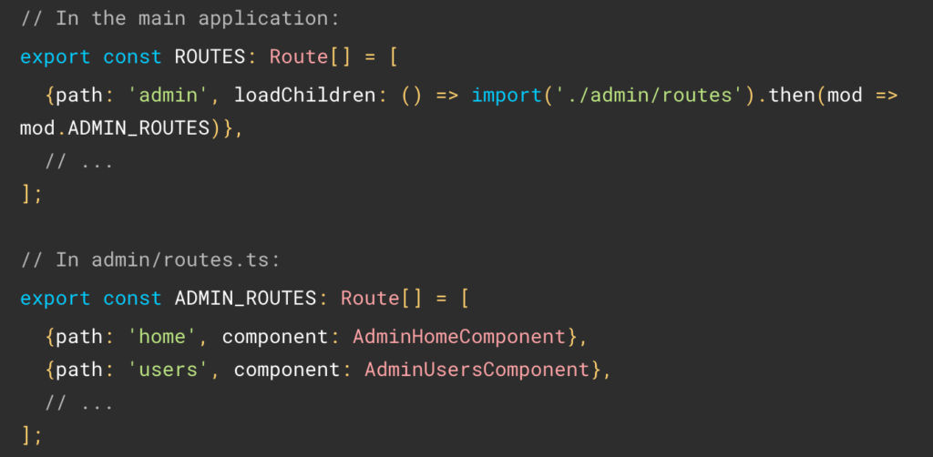
The good news is that we can also lazy-load multiple standalone components. All it takes is creating a specific routing file that we point loadChildren to, like so:

One last cool thing to share today: Along with the above syntax, Angular now supports default exports in Typescript with both loadChildren and loadComponent.

This means that the previous verbose syntax:

loadComponent: () => import('./admin/panel.component').then(mod => mod.AdminPanelComponent)},

Can now become:

loadComponent: () => import('./admin/panel.component')

This works if that component is the default export in its file, meaning that the class declaration looks like this:

export default class PanelComponent

The same applies to loadChildren if the array of routes (or NgModule) is the default export in its file. You can see an example in Stackblitz here.

Adding dependencies to standalone components

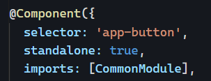
Now that we’ve introduced standalone components, you might have tested them and quickly realized that if you start using directives such as *ngIf, or other components, your code doesn’t compile anymore.

That’s because those template dependencies (used only in the HTML template of your component) are not imported in Typescript (yet), so Angular cannot compile your templates. This doesn’t happen when we use modules because our components are declared there. We also import CommonModule by default, which contains all of the primary directives and pipes of the Angular framework.

If we want to import all these features into our standalone components, we can use the import property in the decorator as follows:

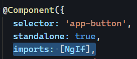
And if you want to import just one feature instead of an entire module, you can do that too – but only if that feature is declared as standalone:

This means that the Angular team has modified all Angular directives and pipes to be available as standalone features (see the ngIf source code here as an example).

Of course, we can still import entire modules if needed or list individual template dependencies, which means that all pipes, directives, and components should be listed individually in the imports array:

You can see an example on Stackblitz here.

What are standalone components?

Since Angular 14, any Angular feature (component, pipe, or directive) can be created as “standalone.” This week, we will dive into what standalone components are, what feature they bring to the table, and how to use them.

One quick note before we start: Whenever you see the words “standalone components,” it really means “standalone components/pipes/directives.” Perhaps we should call those “standalone features,” but I’ll stick with the naming convention used by the Angular team so far, so I don’t stand… alone.

What’s a standalone component?

A standalone component is a component that doesn’t belong to any NgModule. It can be imported on its own and used as-is.

For instance, in the past, we might have a ButtonComponent and a ButtonDirective in a ButtonModule (just like Angular Material does). This means that if we want to use ButtonComponent, we have to import the ButtonModule in our AppModule or feature module. This will make both ButtonComponent and ButtonDirective available for use in our app, even if you just use one of those features and don’t need the other.

Standalone components are different. They can be imported in a module just like other modules get imported in the array of imports:

Importing only the features we need is always better for performance, as the build output will be smaller than if we import an entire module of dependencies. So that would be benefit number one of standalone components.

How to create a standalone component?

With the Angular CLI: ng generate component Button --standalone

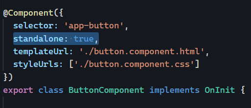
We can also make an existing component standalone by adding the standalone: true property in the @Component decorator like so:

You can see that example in action here on Stackblitz.