As we started covering Angular Material with a few different posts, today, I want to address one of the common objections to Angular Material: Sometimes, people don’t like the look and feel of the library and fear that it won’t match their business requirements.
While it is true that the default themes picked by the Material team aren’t for everyone, with a lot of bright pink, purple or flashy green, I have seen several companies customize Material to make it their own with great success.
Here are a few examples:
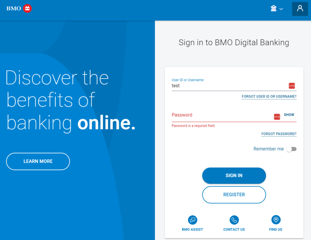
Bank of Montreal (BMO)

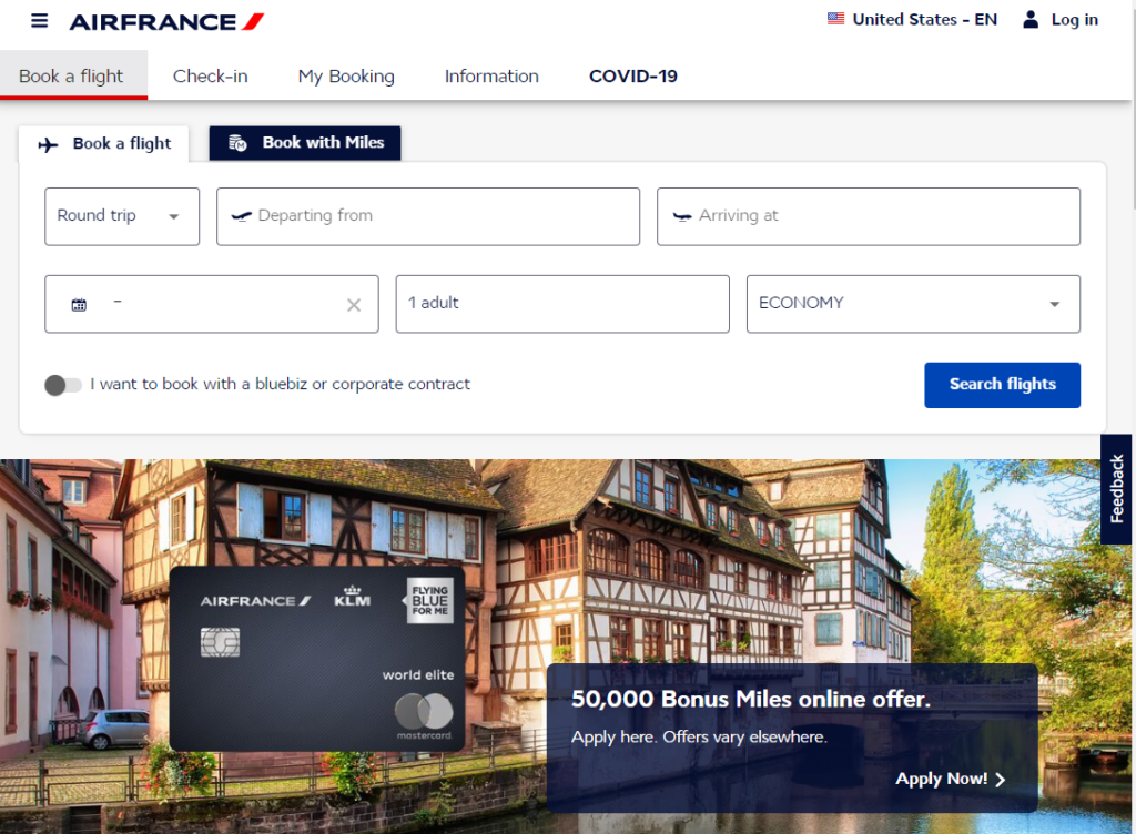
Air France

You can see that in some cases, it’s actually hard to recognize Material components in those apps. On the Air France website, the tabs and slide toggle are the most recognizable components.
How to generate my own custom theme?
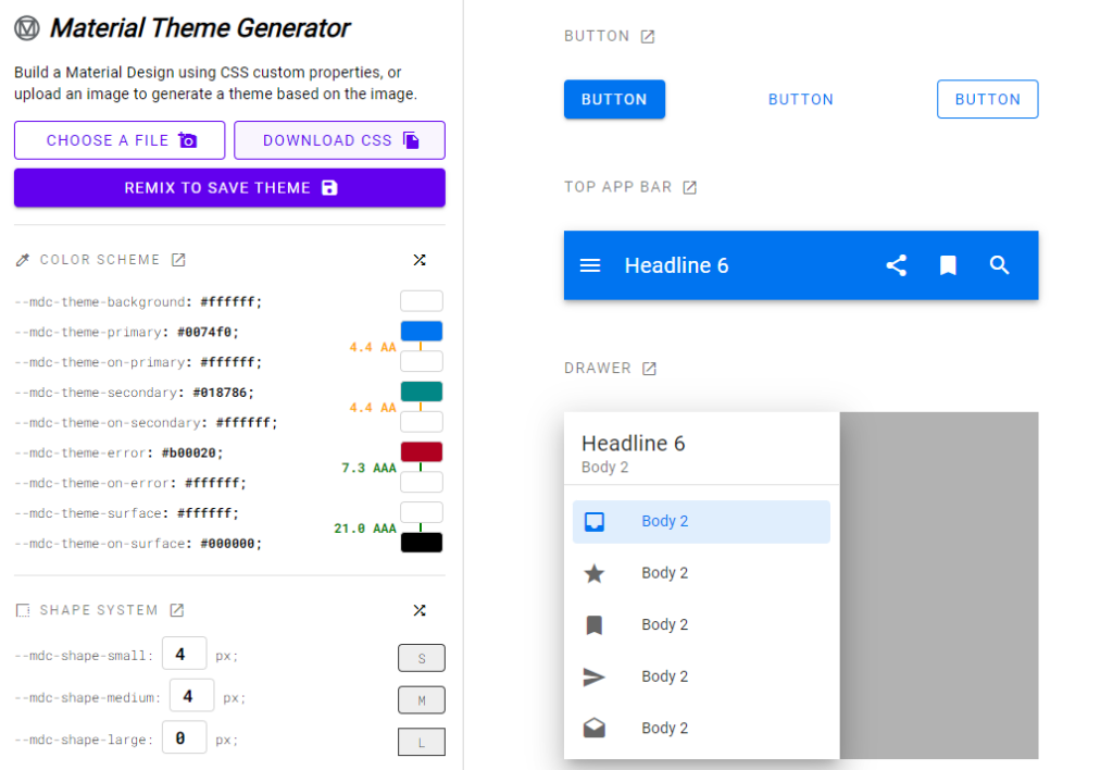
One of the easiest way to see what’s possible is to use the (unofficial – though it comes from a team at Google) Material Theme Generator:

With the theme generator, you can:
- Generate a theme from an image (such as a company logo!) and the tool will pick the colors and do the rest
- Tweak all possible variables using color pickers and see the result on every component on the right-hand side.
- Then export your customization as a CSS file using th “Download CSS” button.
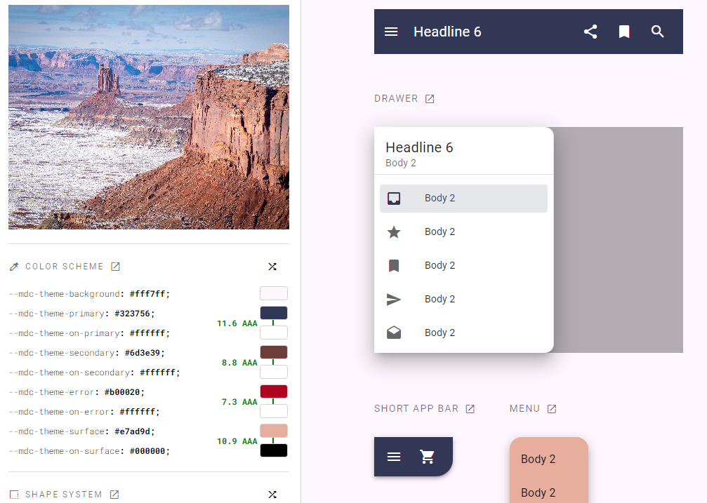
Here I tried uploading a picture of mine from the Canyonlands of Utah last winter, and the resulting auto-generated theme is impressive – I didn’t touch any of the settings:
