This is a guest post by Duncan Faulkner. He is an Angular developer for a fintech company based in the UK. A software engineer with over twenty years of experience, Duncan has been working with Angular since the early betas, written blog posts for ng-conf and several short books on Angular Material. He’s also the maintainer for the @ngbracket/ngx-layout (formerly @angular/flex-layout) open-source project.
You can follow him on Twitter, LinkedIn, Medium and YouTube by using this bio link.
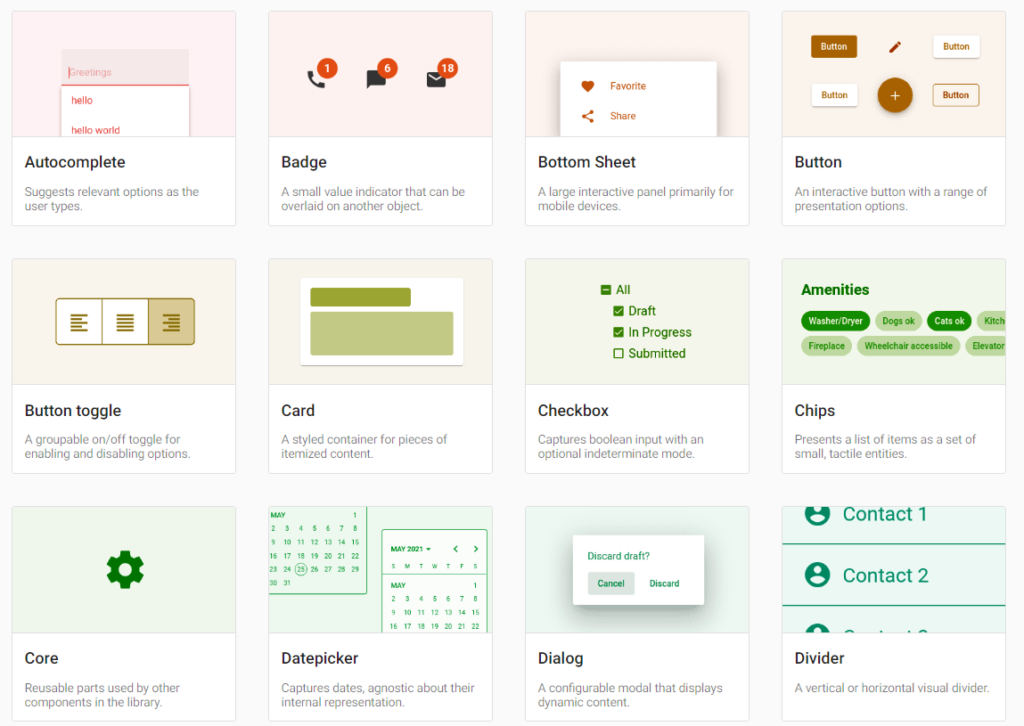
Angular Material is a component library for Angular projects, this library comprises of a number of User Interface components (UI) and a Component Development Kit (CDK). In this series of posts we’ll use Angular Material version 16, there haven’t any major changes to this version of the library.
Some of the components in this library are:
- buttons
- inputs
- cards
- date picker
- progress bar
- grids
- toolbar
- and many more:

Adding Angular Material to an existing Angular application is quite straight forward, navigate to your Angular project in a terminal window and type:
ng add @angular/material
Code language: CSS (css)
This will install Angular Material, the CDK and the Angular Animations, during this installation process we are asked to make a few choices.
- The first one will show the version of Angular Material that will be installed and whether to proceed or not.
- Next, choose either one of the pre-built themes or create a custom theme.
- The available pre-built themes are:
- deeppurple-amber, Palette (Primary, Accent, Warn) – deep-purple, amber, red.
- indigo-pink, Palette (Primary, Accent, Warn) – indigo, pink, red.
- pink-bluegrey, Palette (Primary, Accent, Warn) – pink, blue-grey, red.
- purple-green, Palette (Primary, Accent, Warn) – purple, green, red.
- Custom – I will discuss this in a future post.
- The available pre-built themes are:
- Next, include Angular Material typography styles in our project.
- This will add the
mat-typographyCSSclassto thebodytag:<body class="mat-typography"> <app-root></app-root> </body>
- This will add the
- Finally, include browser animations in our project.
- Declining this will disable most of the animations of Angular Material.
Now the installation is complete, there have been a few changes made to our project.
- The following two dependencies were added to the
package.jsonfile."dependencies" : { "@angular/cdk": "^16.2.1" "@angular/material" : "^16.2.1" } - The
Robotofont was added to theindex.htmlfile:<link rel="preconnect" href="https://fonts.gstatic.com"> <link href="https://fonts.googleapis.com/css2?family=Roboto:wght@300;400;500&display=swap" rel="stylesheet"> - The Material Design Icon font was also be added to the
index.htmlfile.<link href="https://fonts.googleapis.com/icon?family=Material+Icons" rel="stylesheet">
There are also some changes to global CSS styles:
- Removed the margins from the
bodytag - Changed the
height : 100%onhtmlandbodytag. - Made the
Robotofont as the applications default.
Now we have Angular Material installed, let’s try out an Angular Material component in our application. In the app.component.ts file add the following.
import { Component } from '@angular/core';
import { MatSliderModule } from '@angular/material/slider';

@Component({
  selector: 'app-root',
  templateUrl: 'app.component.html',
  styleUrls: ['app.component.scss'],
  standalone: true,
  imports: [MatSliderModule],
})
export class AppComponent {}
Code language: JavaScript (javascript)
And in the app.component.html file add the following line.
<mat-slider>
  <input matSliderThumb />
</mat-slider>
Code language: HTML, XML (xml)
Here we’ll just add a simple mat-slider to the page to test everything is working.

If we now run the application in the browser, we should now see a mat-slider on the page.
Coming up in part two of this series we’ll dig deeper into the mat-slider and the recent changes from Angular Material 15 as Angular Material 16 was mainly minor changes and bug fixes.